Design Inspiration: Pan American
Hey, this is my first blog post! I'm Andi, a designer here at Swash. I figured a good overarching theme to my blog posts could be resources that inspire my future work for our clients.
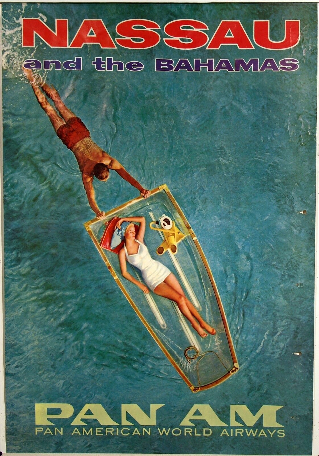
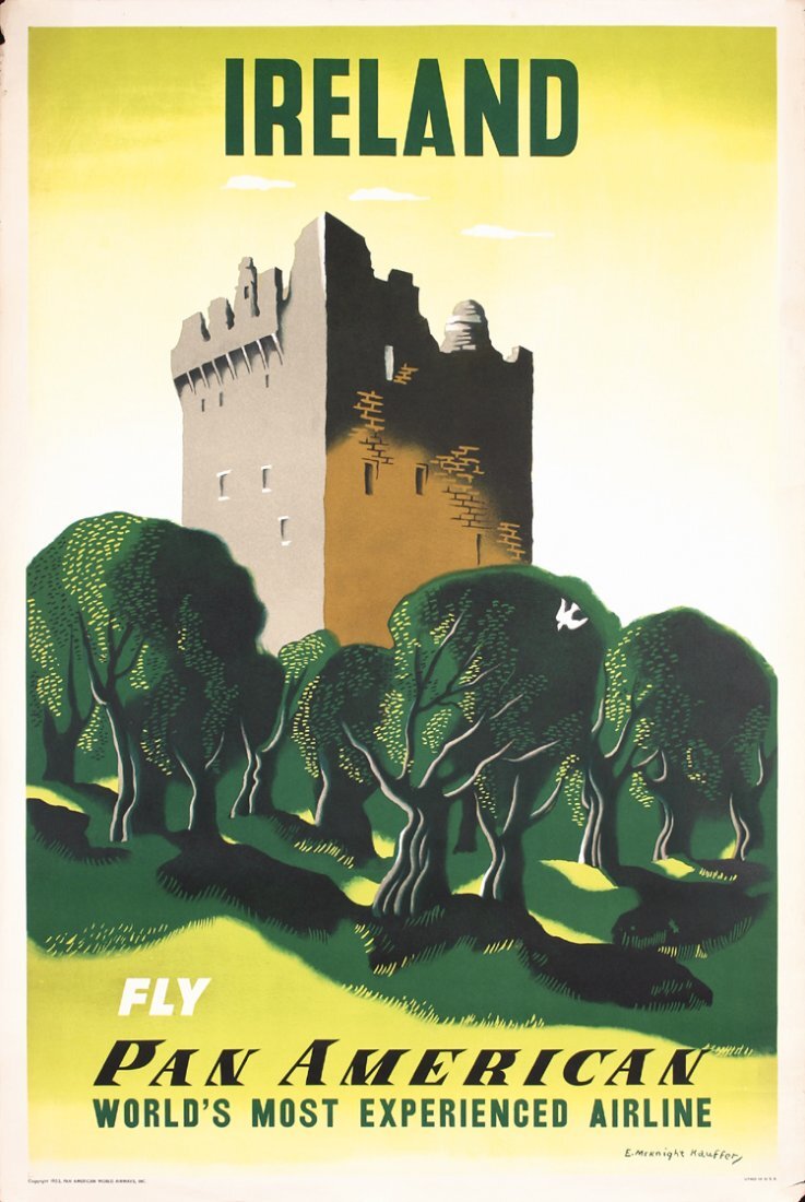
This week, I've been researching the different design styles of the now-defunct Pan American World Airways, an air carrier that shuttered its operations in late 1991. I appreciate the aesthetic of mid-century design – most of the furniture in my bachelorette pad is from that era – so digging through PanAm image searches was a blast.
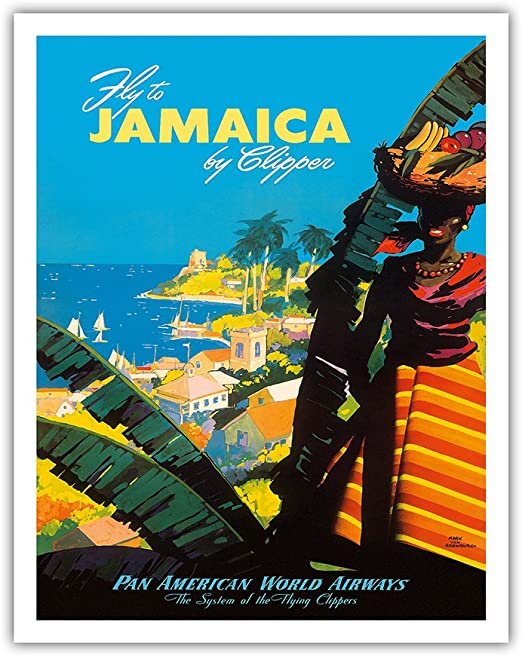
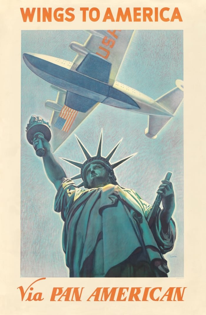
I've collected a few examples here of travel posters and advertisements. Some are from their heyday, before photography was integrated. The illustration styles, color palettes and typography are tailored to fit each destination.
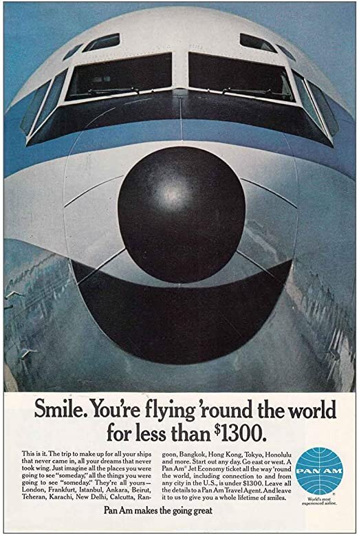
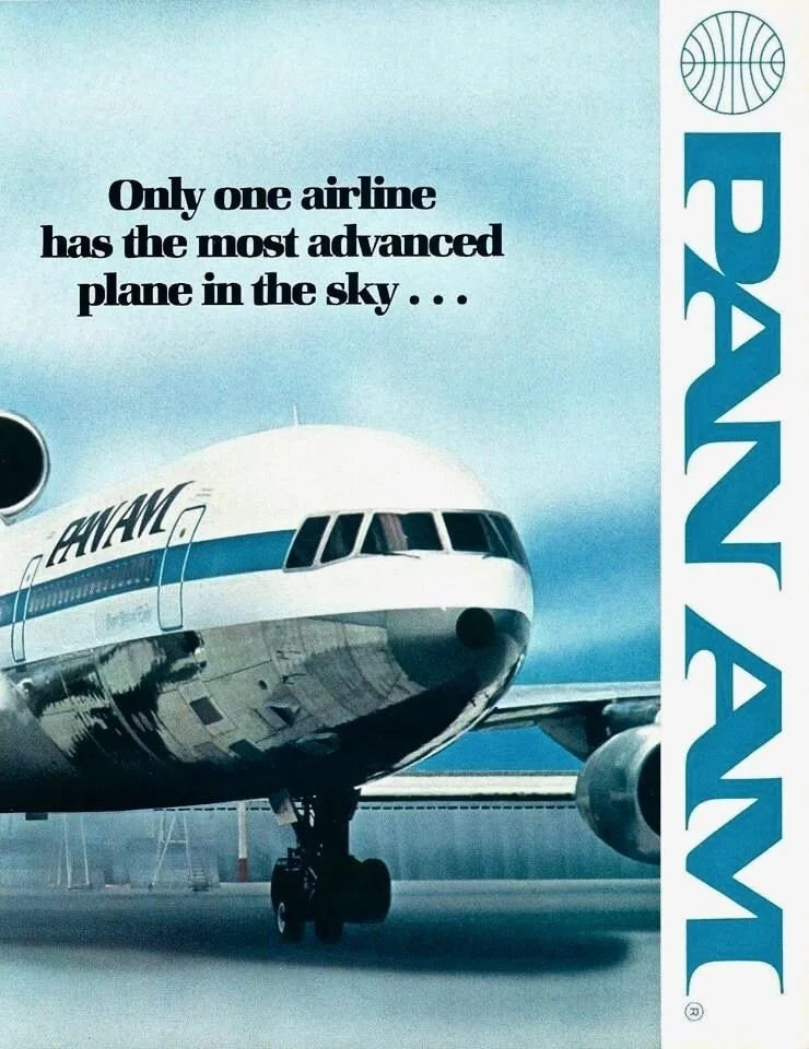
Some of the samples show the iconic PanAm "blue ball" rebranding, which was debuted in 1957. The brand aesthetic shifts from fanciful illustrations to sleek, minimal photography and typography as time passes and design trends progress.