
Recognizing and Harnessing Visual Hierarchy in Graphic Design
Clients who collaborate with our art team at Swash Labs have likely heard me use the term “visual hierarchy” in every design review meeting over the past couple of years.
This is admittedly a very “art school” way of speaking, but it covers so many bases without the need for an in-depth explanation. We all know about hierarchy. Slap a “visual” in front and it’s immediately clear what I’m referring to (hopefully).
Visual hierarchy is the principle of arranging elements to show their order of importance. Designers structure visual characteristics—e.g., menu icons—so users can understand information easily. By laying out elements logically and strategically, designers influence users' perceptions and guide them to desired actions.
— Interaction Design Foundation, holding things down at the top of the Google search results for “visual hierarchy”
I fully acknowledge that not everyone who hires us shares the same arty vernacular as me. Like, did you know that there are seven elements of design AND ALSO eight principles of design? Somehow, even amongst designers and educational institutions, there’s discord about how many of each exist and how to define them. The easy explanation is this: the elements are the building blocks (line, color, shape, etc) and the principles are how you stack those blocks (repetition, movement, balance, etc). Visual hierarchy is considered a design principle.
What makes visual hierarchy so important?
Hierarchical design creates impact, because it directs a viewer’s attention to one specific place first, then creates a natural flow across a layout. This flow could be a zig zag, a straight line, an arc, etc. How your eyes “dance” across a design can tell you whether it’s dynamic, organized, or minimal. 💃
When design is missing a strong hierarchy, it can look cluttered or otherwise difficult to interpret. In terms of advertising and marketing, this can make your brand look unprofessional, inexperienced, or simply offputting. In worst cases, it could even make your graphics inaccessible. Don’t build a wall around your brand — invest in high-quality design!
How do I know it when I see it? And how do I do it myself?
A classic example of visual hierarchy we have all encountered in academic and professional practice is the formatting of a Word document or Google document. Margins, font size, spacing, and line height all impact the legibility and hierarchy of a wall of text:
Bad, Better, Best: No margins or headlines vs. small margins and a bit of formatting vs. spacious margins and rich formatting.
Sometimes our layouts just need a bit of breathing room. Adding white space (also called negative space) in between elements helps set the hierarchy. Formatting options such as pull-quotes, bulleted or numbered lists, dividing lines, or headings, help a page look more polished.
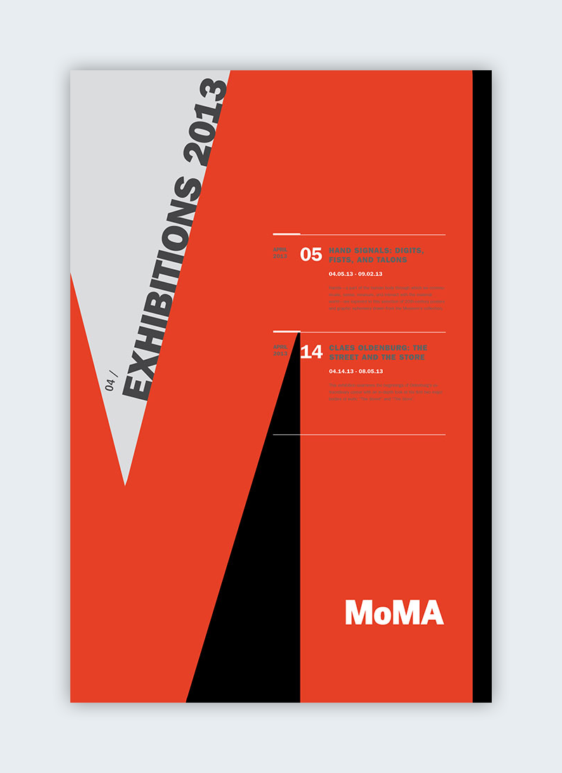
Have any cool posters hanging up in your home or office? Chances are, they contain an exaggerated design element which drives the hierarchy of the layout.


Need some help with a website or graphic design project? We would love to hear from you! Contact the Swash Labs team to level up your brand’s artwork.